Before
2.97%
After
3.21%
 Convertify
Back to Convertify
Free review
Convertify
Back to Convertify
Free review
Case study · Luluwoman
Same traffic.
Same traffic.
Same products.
8% more of it converting.
Luluwoman is a premium contemporary womenswear label. The store looked the part, but shoppers were hesitating at the three moments that decide a sale. We rebuilt the product page, the size guide and the cart around one job: buying confidence. Four weeks later, every commercial metric had moved.
+8%
Relative conversion uplift
2.97%
3.21%
store-wide
The headline change
Start with the cart.
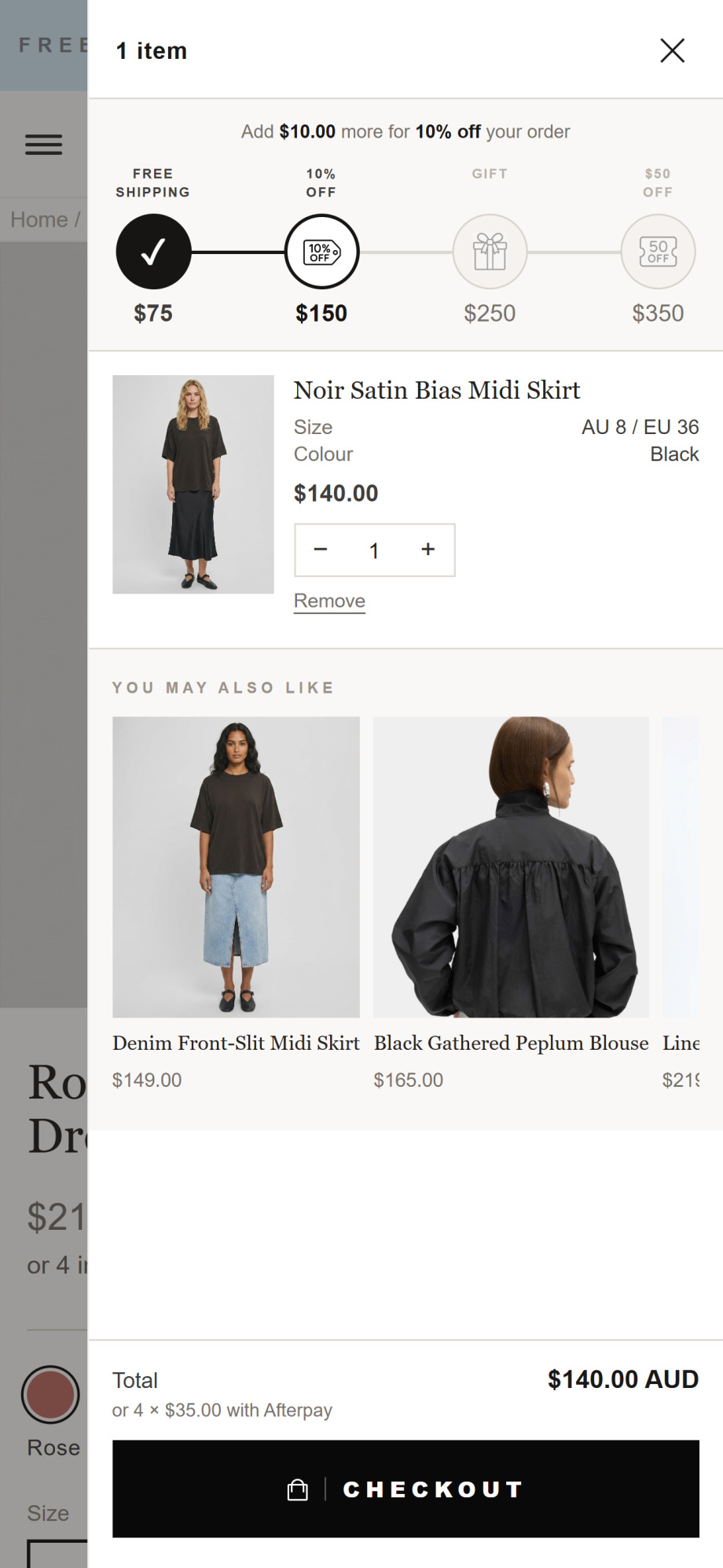
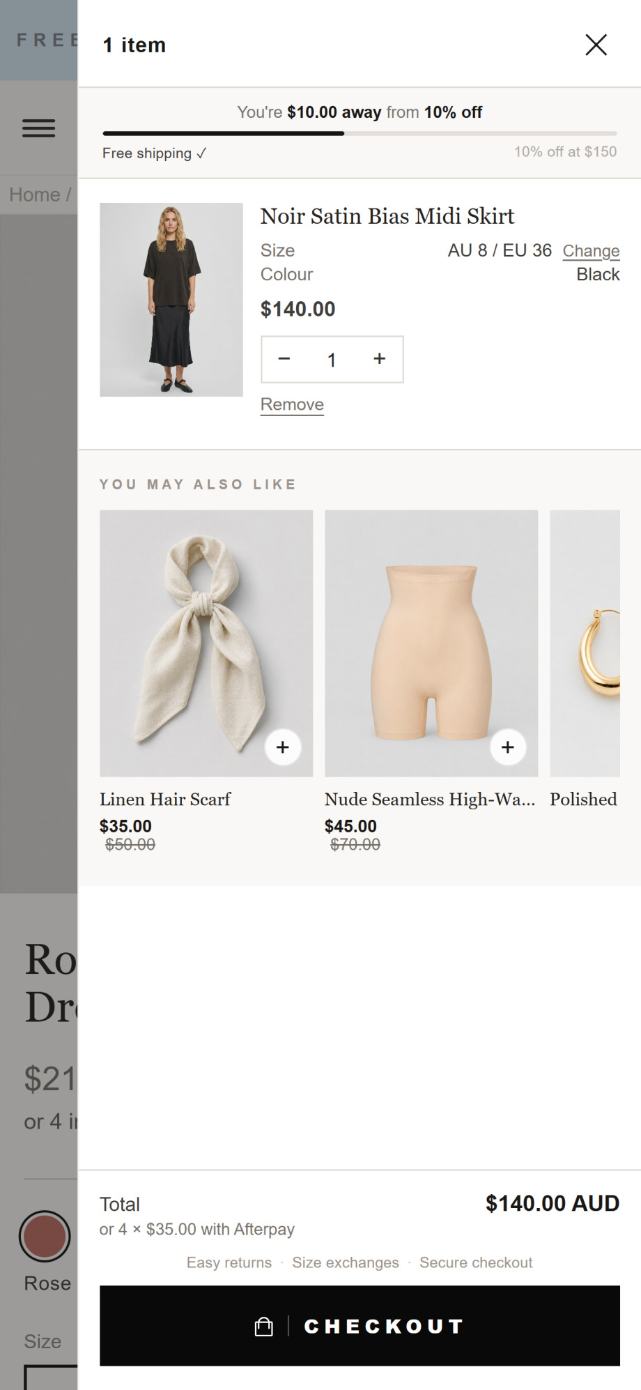
The single change that moved order value the most: four spend tiers and $149 "add-ons" became one goal and two easy yeses.
+45%
of orders picked up a recommended add-on
Measured impact
What it did to the numbers that pay the bills.
The ad spend stayed flat and the catalogue never changed. The same visitors simply converted more often, and spent more when they did.
All figures are relative changes compared with Luluwoman's pre-implementation baseline, measured over the first four weeks live. Conversion rate moved from 2.97% to 3.21%.
The diagnosis
Shoppers arrived ready to buy, then lost their nerve.
Luluwoman already had the hard part right: product people wanted, and traffic arriving to see it. Shoppers were interested enough to reach the product page. They left because the store didn't yet answer the three questions that stand between wanting something and buying it.
Shoppers who liked the product still didn't add it.
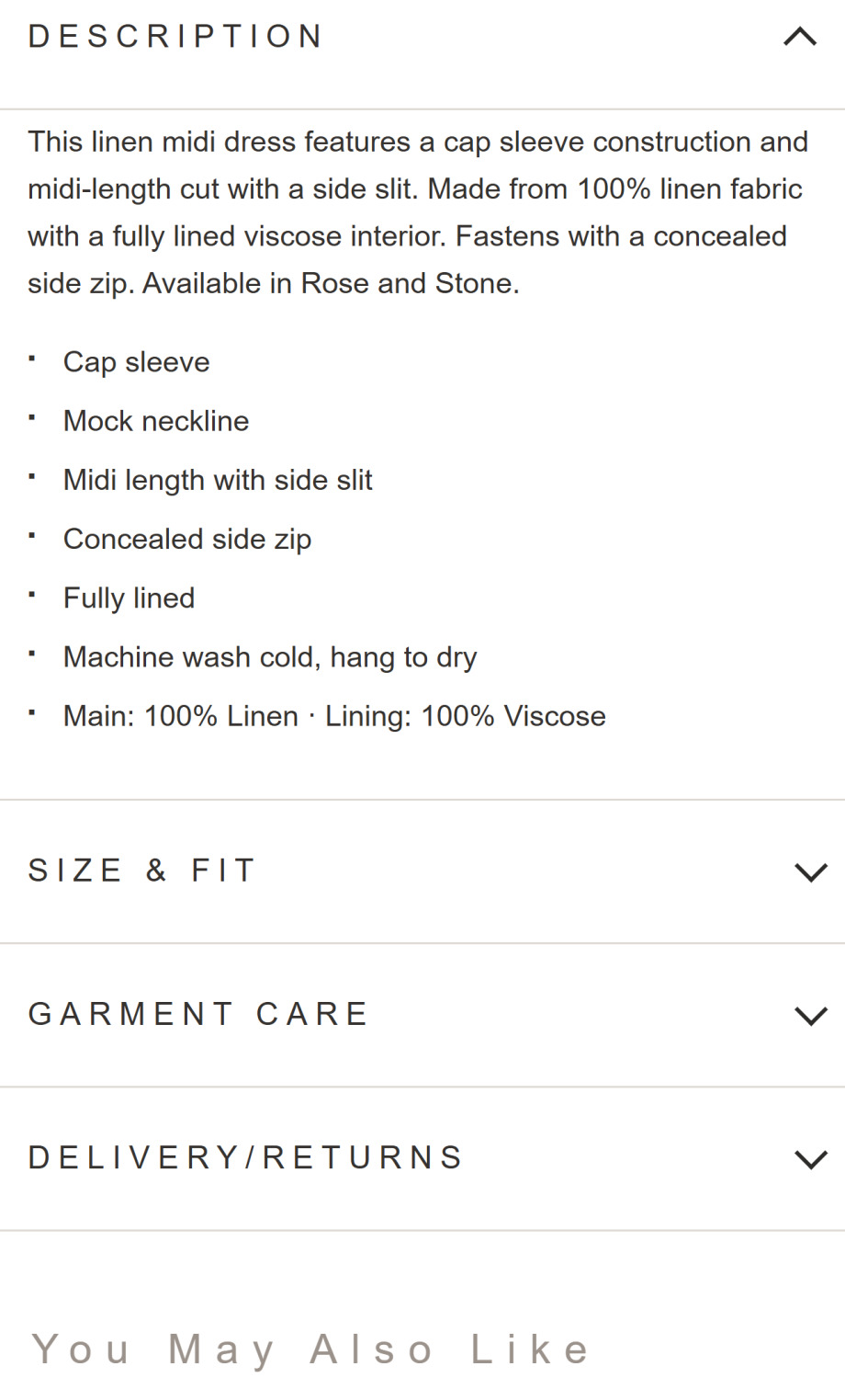
The product description read like a warehouse label, heavy on fabric percentages and wash symbols. It listed what the garment was made of, and never gave anyone a reason to want it.
Costs you: add-to-carts
Shoppers who wanted the product still didn't buy it.
Fit was a guess. A generic conversion chart, buried behind a "size chart" link, told a shopper how EU 38 maps to UK 10. It said nothing about how this dress would sit on her body. Unanswered fit doubt is the most expensive hesitation in fashion.
Costs you: conversions and returns
Shoppers who bought spent the minimum.
The cart pushed hard for a bigger order with a four-stage reward ladder, then offered nothing easy to say yes to. Its suggestions were $149 skirts and $165 blouses. At those prices they read as whole new purchases, and gave a ready buyer a reason to keep browsing.
Costs you: order value
The product page
We stopped describing the dress and started selling it.
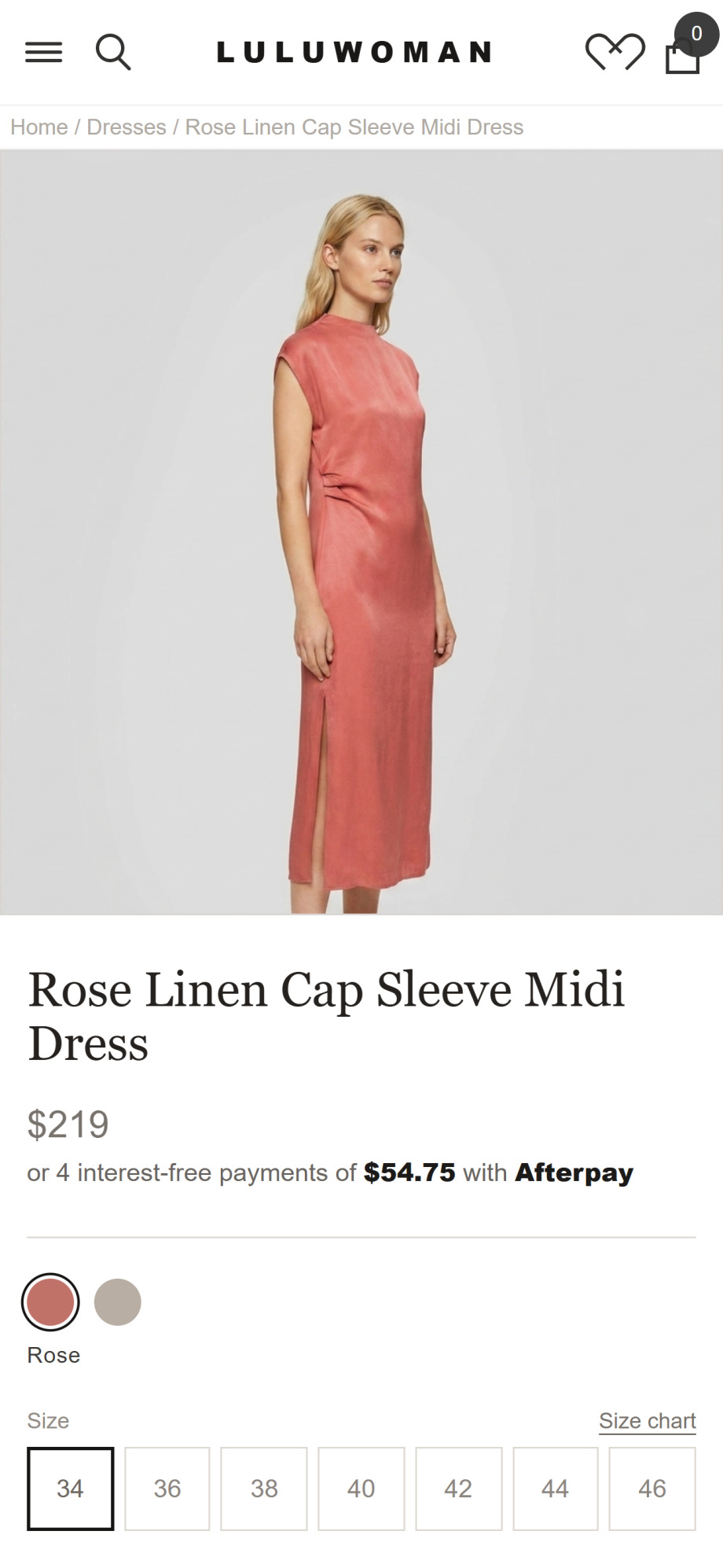
Add-to-cart is the first commitment a shopper makes, and it's an emotional one. Nobody has ever bought a $219 linen dress because it was "fully lined". They buy it because they can picture themselves wearing it.
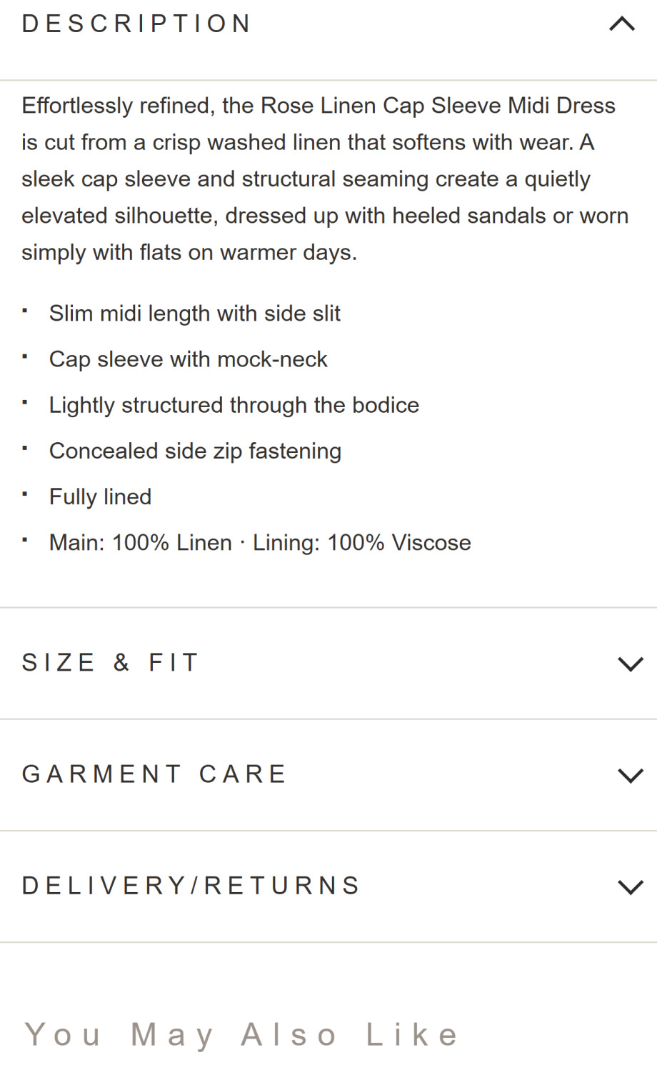
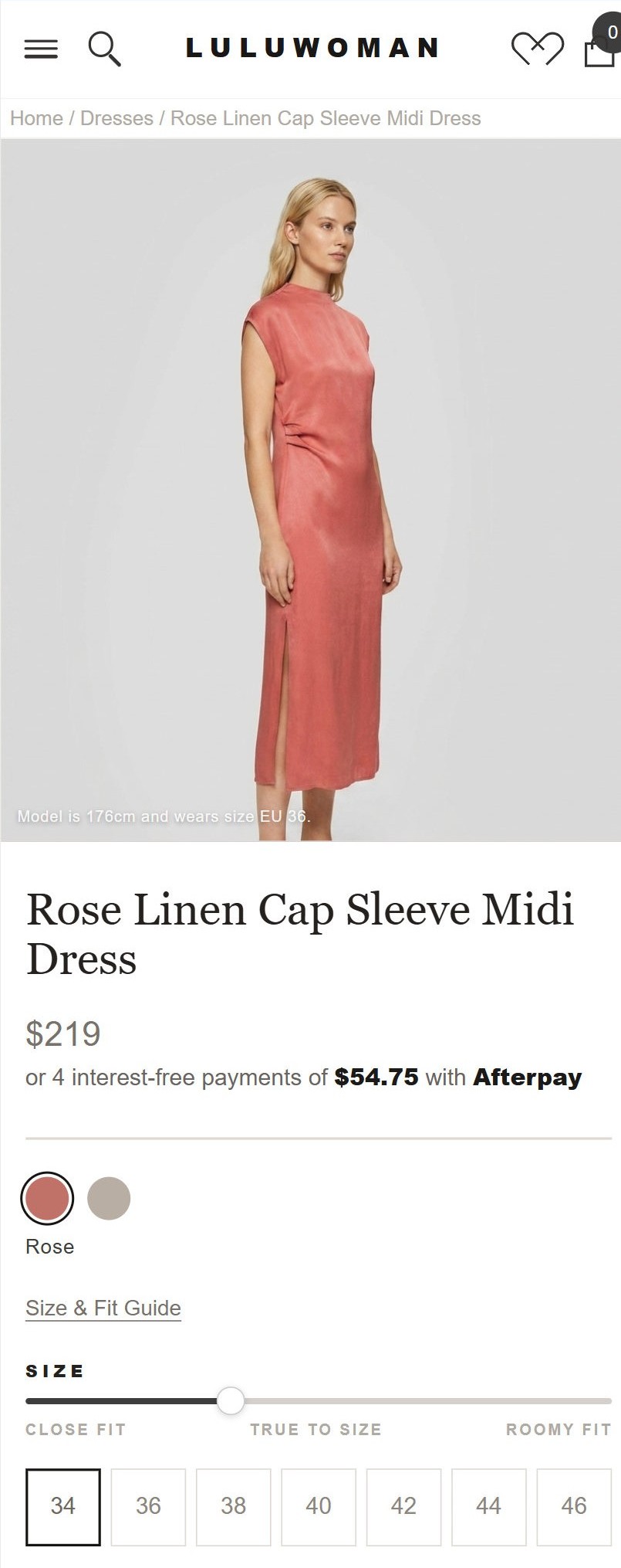
So the description now opens by selling the outcome: how the dress falls and where she'd actually wear it. The specs move underneath, where they reassure the shopper who has already decided rather than lead the pitch. The size selector was rebuilt at the same time, with the model's height and worn size printed on the image itself, so the fit question starts getting answered before she even scrolls.
The product description
Spec sheet → a reason to want it.
The moment she picks a size
A grid of numbers → a guided choice, with fit context on the image.
The size & fit guide
The most expensive question in fashion is "will it actually fit me?"
It gets asked at the worst possible moment, by the shopper with the highest intent standing one click from checkout. If the store can't answer it, she does what every shopper does with an unresolved doubt: she tells herself she'll come back later, and she doesn't.
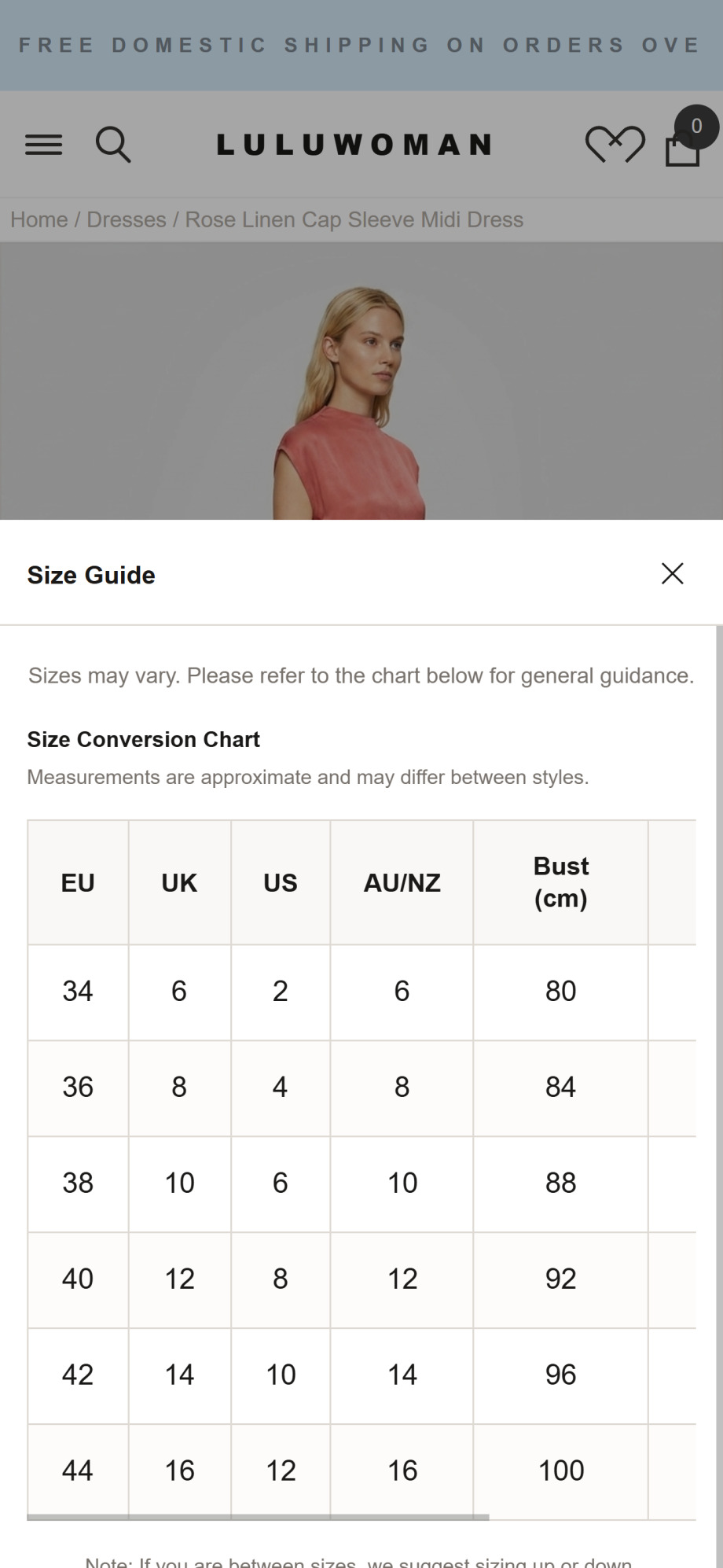
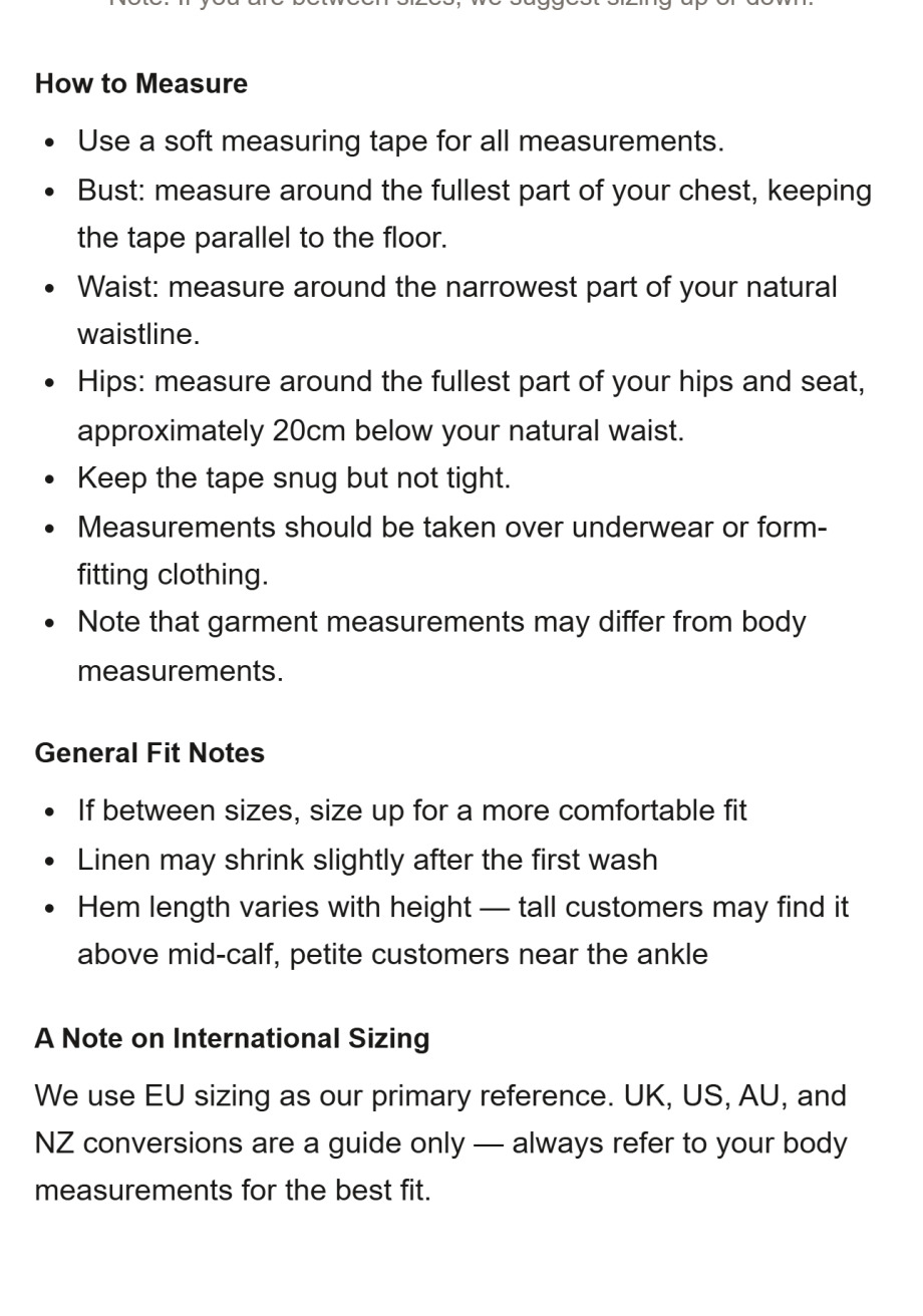
Luluwoman's old guide answered a question nobody was asking. It converted EU 38 into UK 10 and noted that measurements "may vary".
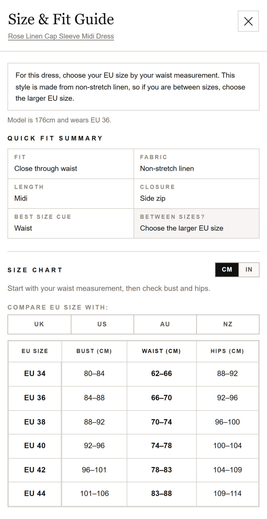
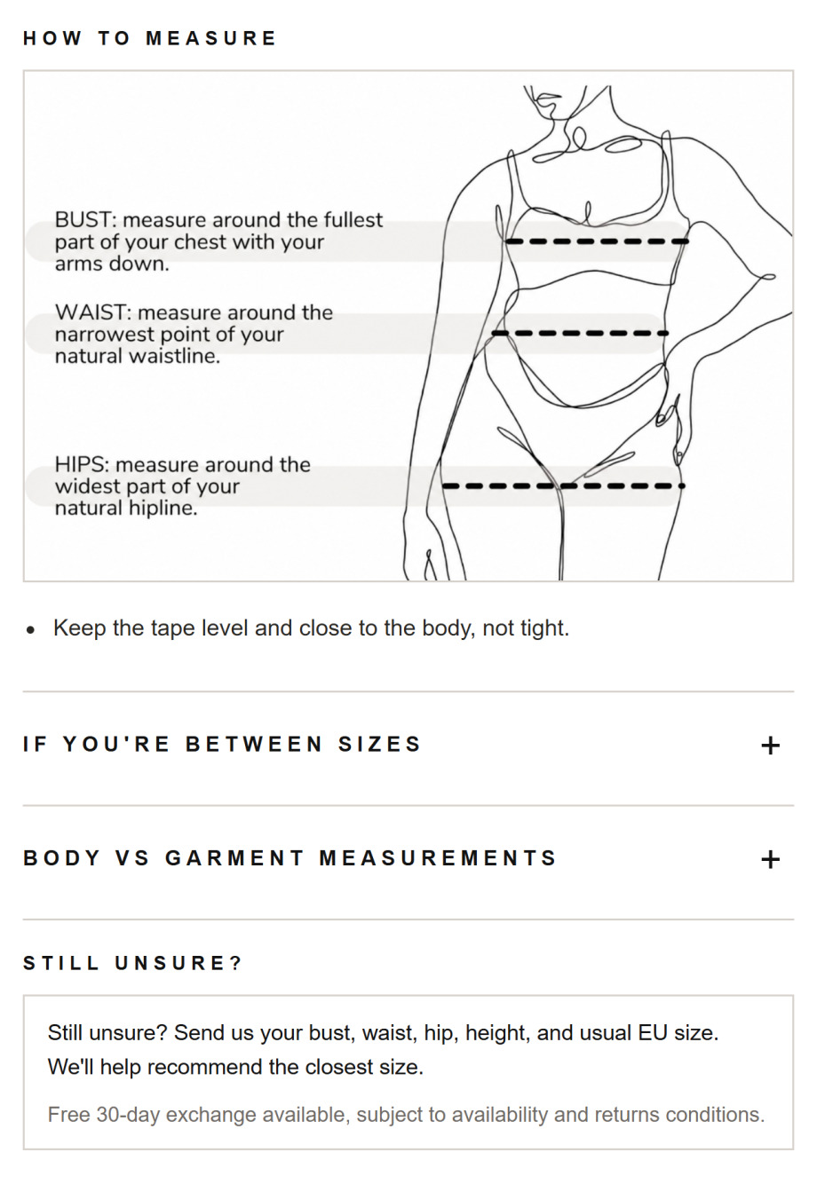
The new guide answers the real question. It opens with a plain instruction for this dress: choose your size by your waist, and size up if you're between, because the linen doesn't stretch. From there she gets a quick fit summary, a waist-first chart, a diagram showing exactly where to put the tape, and a person to ask if she's still unsure.
The guide she opens
A conversion table → a straight answer for this specific garment.
Further down the guide
A wall of bullet points → a diagram, and a way to ask.
The cart
The old cart asked for more money. The new one makes it easy to spend.
Luluwoman's cart was working hard and earning nothing. It opened with a four-stage reward ladder that ran from free shipping all the way to $50 off, which is a lot of arithmetic to hand someone who has already decided to buy. Then it recommended a $149 skirt and a $165 blouse, both of them whole new purchase decisions that gave a ready buyer a reason to leave the checkout and start browsing again.
The new cart gives one goal in one line, you're $10.00 away from 10% off, then makes closing that gap easy. The recommendations became things she'd plausibly want anyway, like a $35 scarf or $45 shapewear, each showing its saving and each addable in a single tap without leaving the cart. A quiet row of reassurances sits directly above the checkout button, covering returns, exchanges and secure payment, right where the last hesitation happens.
The cart drawer
Four spend tiers and two new decisions → one goal and two easy yeses.
The compounding bit
None of this required a single extra visitor.
Luluwoman didn't touch their ad spend, their product range or their pricing. What changed is how many of the people already landing on the store finished what they started, and how much each of them was worth when they did.
Those two things multiply. An 8% lift in conversion on top of an 8% lift in order value means every visitor arriving at the store is now worth measurably more than a month ago. That gap widens every time they run a campaign or send an email, on traffic they are already paying for.
Three pages touched, not a full rebuild
Measurable inside the first four weeks live
Every point of recovery drops to the bottom line
This isn't a one-off. Oak & Hyde saw +43.75% conversion rate and +60% add-to-cart from the same category of fixes.
"We knew our product pages were underperforming and our average order value had plateaued, but we couldn't pinpoint why. They (Convertify) quickly identified issues around fit, product communication and cart bag building opportunities that we had overlooked. We really appreciated the great communication and always being kept informed throughout the project."
Maria
Founder, Luluwoman
Your store
Your store is leaking too. Let's find where.
Send us your store and we'll record a walkthrough showing the clearest places you're losing sales you've already paid for. Free, and no strings attached.
No credit card · No retainer · Reply within 24 hours